“Buy now“ and “Learn more”– How to Optimize your Call to Action
Marketing
Posted 03 May 2022
„Social Media Ads or SEA? Click here and learn more about which type of advertising works best in the B2B industry!“ – This is one example for how a call to action (CTA) can look like in order to encourage the audience to make the final click.
While a call to action basically serves this very purpose, it also raises the questions of why it is called such and what needs to be considered when using a CTA for companies to benefit from it.
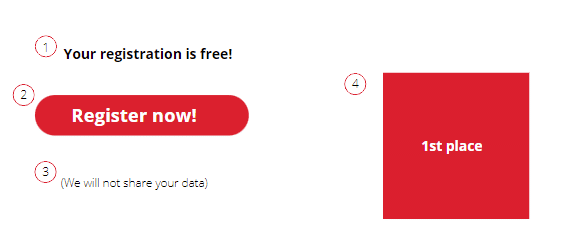
A CTA serves the purpose of animating the reader to execute a distinct activity. Being succinctly formulated and unambiguously perceived, the CTA is oftentimes formulated in the imperative. The targeted placement of prompts is therefore aimed at interested parties. That is to provide them with an impulse for the desired action and to arouse the user’s curiosity about certain postings, products, or newsletters. In order for users to actually act accordingly, they must be specifically moved to do so – and that is done through a CTA. Many people mistakenly believe that a call-to-action only consists of one button or link. That is not always the case. It contains many more elements and can be divided into up to five parts:

Whereas the first three items represent the major elements defining each call to action, the two last ones come in secondary, meaning they are merely supporting elements that do not directly belong to the CTA yet can have a deciding influence on it.
The lead-in (1) is a text before or above the continuing link or button (2). It serves to lead visitors to the actual call to action, builds trust, and ensures that they are in the right mindset to perform the desired action. The actual call to action button (2) is located between lead-in and lead-out. Visitors who did not want to click the button immediately are then helped by the lead-out (3), which builds the necessary additional trust (4). This intermediate position directs readers back to the CTA and prompts them to execute the click eventually, although they were actually already dissuaded from doing so.
Indecisive users are thus helped in their decision-making process and are given the opportunity to engage with the topic they are reading about. Companies and marketers can therefore strategically use the various elements of a CTA to counteract the possibility that their users perceive the content with interest, yet do not act in the desired sense by showing them their available options as in “Order now”, “Learn more”, or “Register here”. An ideal CTA creates not only trust, but also a certain need and urgency in the reader to successfully initiate the final click.
The instrument of directly addressing recipients is primarily used in the field of marketing. In a TV ad for example, the call to action can be an invitation to viewers to call a number or arrange for a test drive at their local car dealership. In online marketing, the call to action is often used in the shape of a button or link such as “Try now for free”. A CTA is also often found in hidden prompts such as “Subscribe to newsletter now”, “Click here” or “Watch full video”.
As example serves the landing page of HBI’s Digital Executive Program, which establishes executives and corporate responsibles as thought leaders. Interested in our program? Read on here.
(Busted – but this is a call to action article, after all).
The significantly eye-catching “Get-Started!” button encourages users to expand their expert status with the help of the HBI Digital Executive Program and to sign up to it immediately – the clearly intended goal of this landing page.

Source: HBI Helga Bailey GmbH – International PR & MarCom (HBI Digital Executive Program)
A call to action is the specific placement of a request for action that does not merely appear in the form of a link or button. Bundled information is intended to prompt users to take a specific action through an explicit form of appearance. This method is used primarily in marketing and, thanks to their imperative character and simplicity, represent the fundamental key to success.
Until now, the call to action was nothing more than a simple necessity on e-commerce platforms and on landing pages, that oftentimes was not paid much attention to. Meanwhile the focus has shifted as it has become clear: a well-thought-out CTA is often the final step that determines the success towards a conversion.